Preview of Rulai homepage update

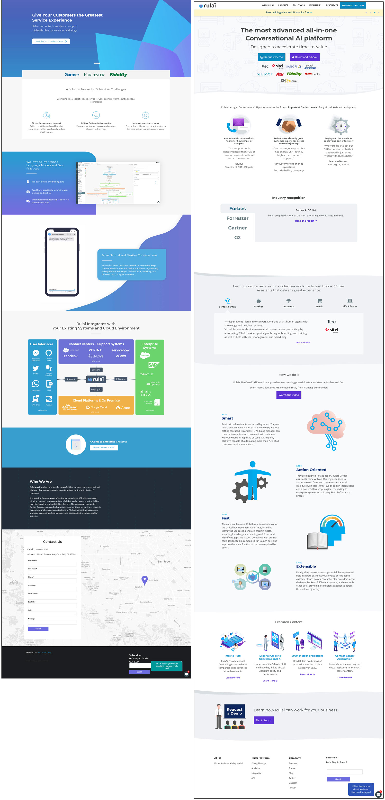
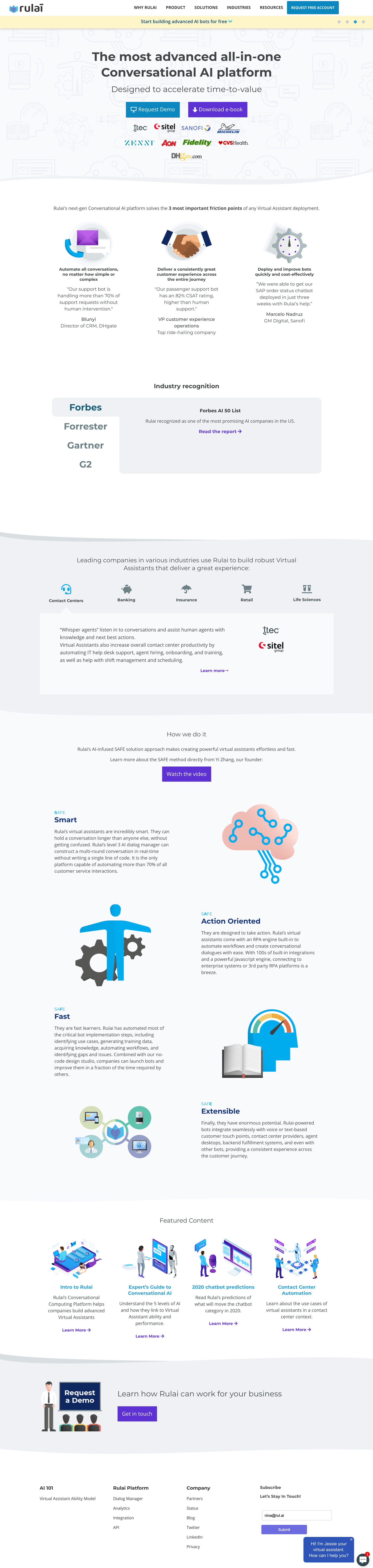
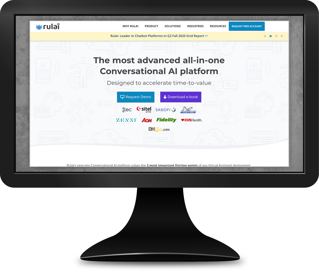
Rulai homepage and branding update

I was brought on to update the company brand, working closely with the CEO to create a brand identity more in line with his marketing goals. I updated the company's marketing website with that new visual identity, bringing to life the new content he and the executives had created.

The old site design was visually weighed down with large blocks of dark colors. I created a layout with a more pleasing visual flow, while maintaining modular flexibility so we could use the sections as templates to dynamically add new content via Wordpress. I employed subtle shades of gray to distinguish sections instead of the harsh color changes that dominated the old design. This allowed the user to focus on the content, which had been rewritten to better cater to individuals unfamiliar with chatbots.

As part of this larger design overhaul, I ensured certain smaller details were not ignored. I found several instances of text that did not meet W3C recommendations for visual contrast, so I developed a color palette to prevent this. I removed animations that had been used on the previous design, because they often loaded too slowly and could cause the user to miss information.

I've also included concept work and a final design I created in order to update Rulai's logo as part of my overhaul of the brand identity.

Side-by-side comparison of old homepage, left, with new design

Rulai homepage: side-by-side comparison with old site

Full screenshot of updated Rulai homepage

Rulai full homepage screenshot

Concept Logo Phase 1: Sketches

In my initial sketches I explored a variety of concepts, exploring how the shapes and negative space of the lettering could be leveraged to communicate certain ideas. I wanted to convey a sense of play, as the chief selling point at the time was the product's ease of use to non-coders. I explored using different visual elements: Coding brackets and parentheses, bots, chat bubbles, ellipses to symbolize the typing indicator used in typical messaging apps, and modifications to the original flower logo.
Initial pencil sketches

Phase 2: More refined sketches

I created cleaner sketches of the CEO's favorite concepts and added some new ideas.
Second round of pencil sketches

Phase 3: Creating digital concepts in Illustrator

The CEO ultimately decided to retain the existing logotype to ensure the brand was still recognizable to existing customers and prospects, so the focus shifted to reworking the flower logomark. I created vector artwork based on the updated flower concepts I had already sketched. The original logo is displayed here for your visual reference.
Digitized concepts

Final design

In the final draft I updated the selected logomark colors to make it more bold. The flower shape was intended to bring to mind the pattern blocks children play with to learn geometrical concepts. The light blue highlight in the top central shape represents openness: These two concepts together were meant to show how easy the product was to use while also being infinitely customizable for any business purpose.
I also conceptalized logo modifications we could use in special cases.
Final selected logo with additional concepts for modofications to the logomark for special cases: LGBTQIA+ support and environmental causes
Back to top